
Bushma
Brand Identity
Package Design
Brand Strategy
Art Direction
Bushma is a men's jewelry line based in Los Angeles. Founded by Ukranian expat, Alex Krivoshey, he hoped to create pieces for the modern man. His aim was to create a brand that would give men the confidence to wear accessories made especially for them.
Promotional video courtesy of Bushma
Concept and Solution
Alex wanted to create a brand for Bushma that fit in the modern world and was also timeless. We started with the logo as it was going to be included not only on the website but on every jewelry piece as well. The goal was to create something that would have a simple silhouette but stood out as a unique graphic as well.
Alex often voiced that he wanted the brand to feel luxurious but be affordable to his key demographic of men in their 20s and 30s. We agreed that the best expression for this brand was to use a simple color palette, and thin shapes to evoke a sense of modernity and elegance.
The Bushma logo
Alex wanted the wordmark to be written all lowercase to make the brand feel accessible and casual, while the typeface would elevate the overall aesthetic. He had already decided that the graphic would be two b's as he wanted to reinforce the brand's name in the viewer's mind. We went through several styles to arrive at a serif wordmark and graphic that focused on the timeless aspect of the brand.

Bushma business cards

Bushma webpage
Implementation
After agreeing on a logo, typefaces, and color palette, Alex and I discussed collateral material for the brand. As he wasn't planning on having a brick and mortar, his main forum for business would be his website.
I designed some business cards for him to use during in person meetings, and we discussed layout and tone for his website.
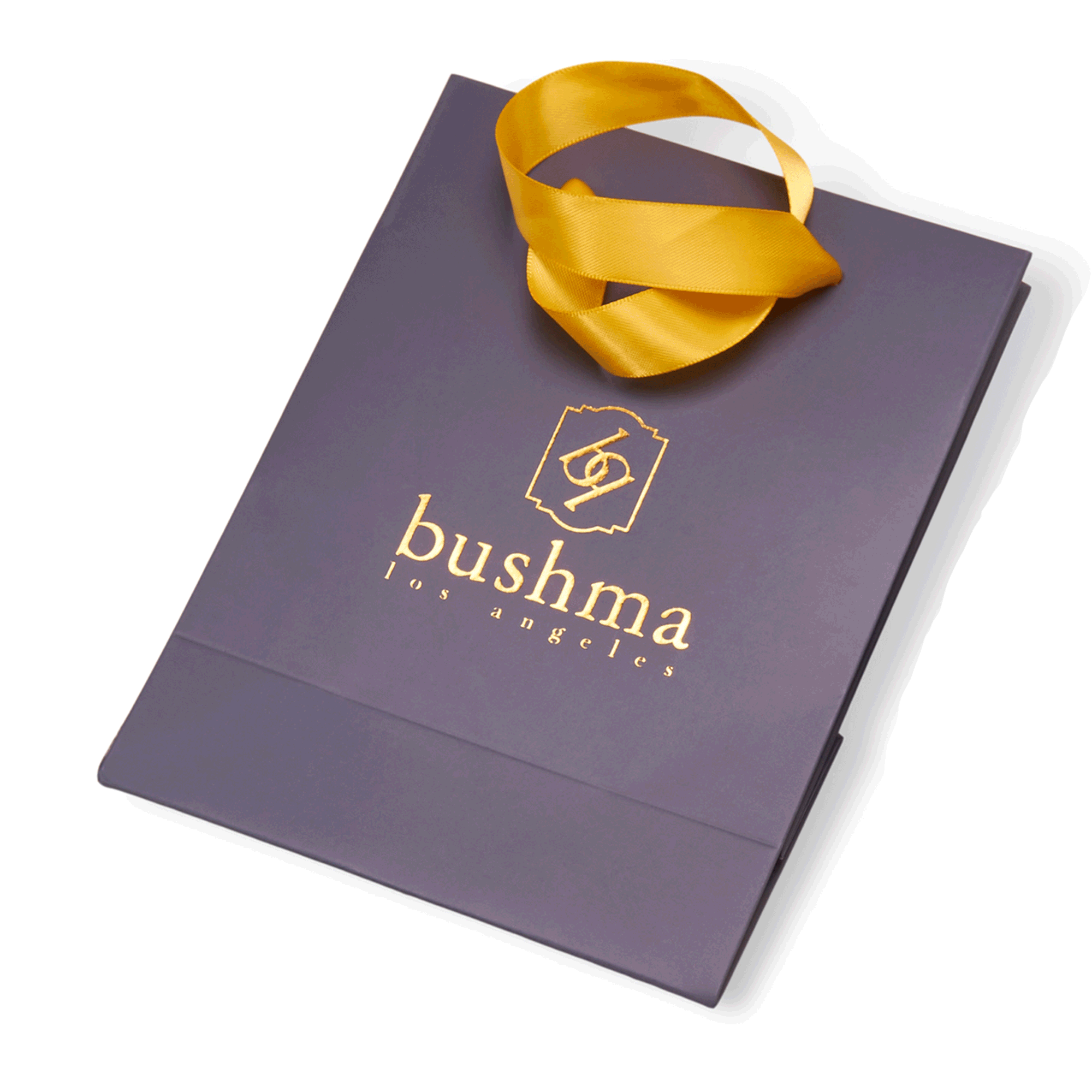
There were several pieces that were going to make up the package design of Bushma. Alex wanted the unboxing to be an experience for his clients. I discussed designs with him and came up with a bag, a ribbon, a box, a hankerchief, and a pouch design included in every Bushma purchase.
Bushma packaging

Art Direction
In starting the business, Alex wanted to take several photos of the merchandise now with the logo printed on them. I accompanied him to a photo shoot and helped direct the shots that were then featured on the website and Bushma's social media outlets.


Color Palette
As Alex and I had discussed the color palette for the brand, he told me he didn't want to overcomplicate it so that the jewelry pieces could stand out.
We agreed on the classic mix of black and white. I'd further suggested we add gold into the mix as it was a timeless color associated with jewelry and would reinforce the luxury aesthetic we were aiming to achieve.

Typography
In our original discussions on typography, Alex wanted a very modern and sans serif typeface. As we got further into our discussions and Alex had repeated that he wanted the brand to be timeless, I suggested we look at some serif typefaces. We agreed on LTC Caslon and Paganini for their elegant shapes.